


 Posts
Posts


Follow this step by step guide to create a dark and sleek navigation menu design. We’ll begin by building the visual concept in Photoshop, export the image files, then build up the final menu in HTML and CSS using a range of declarations to replicate the design and layout in code.
The PSD Concept

Open up Photoshop and create a new document with a black background. Use the handy pixel swatches I posted a few weeks back to fill a new layer with a cool pattern. Press CMD+I to invert the colours, then set the blending mode to Screen at 10% opacity.

Use the Rounded Rectangle tool with 50px corner radius to draw the basic shape of the menu bar. This large corner radius will help create a long ‘pill’ shape.

Double click the shape’s layer to add some Layer Styles. Begin with a Gradient Overlay flowing vertically between two dark grey colour samples.

Give the menu a subtle three dimensional highlight using the Inner Shadow feature. Set the mode to Normal, colour to a mid-grey, distance to 2, choke to 30% and size to 5px.

Draw the first menu item using the Rounded Rectangle tool on a new layer. Nudge the shape into position using the cursor keys.

Open up the layer style settings for the menu item and add another Gradient Overlay. Select slightly lighter grey colour samples.

Add an Outer Glow effect but change the settings to Normal, a dark grey colour, 50% spread and 5px size.

Finally add a 1px Stroke effect using an almost black colour sample. This stroke effect combined with the outer glow gives a cool chamfered effect around the button.

Use the Text tool to type out the relevant words on each of the buttons. Set the font to Helvetica Bold with a near white fill.

Open up the layer style window for this text layer and select Drop Shadow. Change the angle to -90 degrees and alter the settings to 1px distance and 100% spread to create a subtle inner shadow. We could have used the Inner Shadow effect, but this would add the effect inside the text which would affect its legibility. A Drop Shadow adds the effect on the outside, leaving the original text intact.

Duplicate the menu item to create the remaining buttons on the menu and space out each item evenly.

Next we need to design a style for the button’s pressed state. Open up the settings for one of the button and alter the gradient angle to -90 degrees. Slightly darken the colours to give the impression of shade.

Draw a square selection over the background pattern, taking into consideration key points in the pattern to allow the image to repeat. Export this as a PNG image.

Toggle off all the other layers and draw a selection around the menu background, press CMD+Shift+C and paste into a new document. Export this file as a PNG-24 graphic with transparency.

Make selections of the button states and paste them into a new document to form a little sprite graphic. Export this file as a PNG-24 image.
The HTML Markup
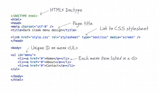
In order to build the menu as a fully working web page we need to write out a little HTML code. Begin with a document with a basic structure of Doctype, Title and CSS stylesheet link, then add a <ul> with an ID of menu. Write out <li>elements with anchors for each menu item.
The CSS Styling

The menu really comes to life when we add the CSS styling. Begin with a simple reset to remove any browser defaults, then add some styling to the body, here I’ve added the repeating pattern background image for the sake of the demo.
Next, target the unordered list with ID of menu and give it a specific width and height according to the size of the menu background image. Add a touch of padding to move the buttons into place and minus this figure from the height to maintain correct box model calculations.

We can then target the child list and anchor elements to style each individual button. list-style: none; and float: left; removes the default bullet points and floats the list items side by side. The actual button styling is added to the anchors. display: block; is first added to change the anchor element from inline to block, which then allows for an exact width and height to be added. Add the button image as a background and style up the text as 18px bold Helvetica. The inner shadow effect can be created using the CSS3 text-shadow property, then the actual font colour and alignment will finish it off to match the concept.
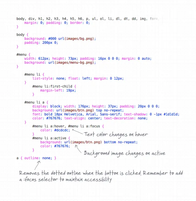
Now the default button state is in place, we need to add the different effects when the button is hovered and pressed. The CSS pseudo selectors do this job. Set up a new declaration using the :hover selector and adjust the colour to the near white selection from the concept. The :active selector can then be used to style up the button when it’s pressed by the user, alter the background image position to bottom so it displays the inset effect.
If you test the button in a browser you’ll notice an ugly dotted outline ruining the effect. a { outline: none; }; will correct this, but don’t forget to add a backup :focus declaration to provide visual feedback when the user has keyboard focus on that particular element.
The Final Menu Design
That makes our dark and sleek menu design complete. Here’s the full HTML and CSS:
HTML
<!DOCTYPE html>
<html>
<head>
<meta charset="utf-8" />
<title>Dark sleek menu design</title>

<link href="style.css" rel="stylesheet" type="text/css" media="screen" />
</head>

<body>

<ul id="menu">
	<li><a href="#">Home</a></li>
	<li><a href="#">About</a></li>
	<li><a href="#">Contact</a></li>
</ul>

</body>
</html>
CSS
body, div, h1, h2, h3, h4, h5, h6, p, ul, ol, li, dl, dt, dd, img, form, fieldset, input, textarea, blockquote {
	margin: 0; padding: 0; border: 0;
}

body {
	background: #000 url(images/bg.png);
	padding: 200px 0;
}

#menu {
	width: 612px; height: 73px; padding: 16px 0 0 0; margin: 0 auto;
	background: url(images/menu-bg.png);
}

	#menu li {
		list-style: none; float: left; margin: 0 12px;
	}
		#menu li:first-child {
			margin-left: 19px;
		}

	#menu li a {
		display: block; width: 176px; height: 37px; padding: 20px 0 0 0;
		background: url(images/btn.png) top no-repeat;
		font: bold 18px Helvetica, Arial, Sans-serif; text-shadow: 0 -1px #1d1d1d;
		color: #767676; text-align: center; text-decoration: none;
	}
		#menu li a:hover, #menu li a:focus {
			color: #dcdcdc;
		}
		#menu li a:active {
			background: url(images/btn.png) bottom no-repeat;
			color: #767676;
		}

a { outline: none; }
0 comments:
Post a Comment